Saturday, February 11, 2012

Journal 3 Tanya

For the last assignment, again continuing with the theme of my other projects, I am going to make a sculpture that is basically a basket filled with hand grenades. These will be colored like Easter eggs but I don't want the "basket" to necessarily blatently read "Easter". I will either convert a military helmet shape into the basket and use the chin straps for the handles. The grenades will be press-molded. I haven't decided if I will just make a helmet to look like a helmet or if I will attempt to weave the basket into a helmet shape.


This basket is by Monica Guerrero. I kind of like the looseness of the weaving pattern.


I also like the way she applied the finish, making look more like wood.


This helmet is cool and is the type I'm going for.

It could be mine for only $75...joking. Found object??? Ha, ha.


Here is an example of one with the chin strap.


I do have a half style motorcycle helmet that I can use to model the military one with. Will just have to make some alterations. The granade mold will be made from a dummy grenade.


Tuesday, February 7, 2012

Journal #3; Large Jars: Louise Shye

Sequoia Miller: I like the way these jars are shaped; there is a quality to the cornered box like shape, however the roundness to the slab sides distract the box style. I would love to incorporated  a distorted distraction to  a cornered shape. By manipulating the slabs in some way, it creates an abstract form; something I have yet to create...something abstract. The way the black and turquoise is on the second piece in the first photo I have here is something I would love to have turn out on my Jars!
I would like to go back to Sam Chung's work, his slab built pieces are very abstract, and as a viewer these cloud like shapes are very memorizing. I've never built anything abstract, and I've enjoyed slab  building from making the three jars. However my jars are two feet tall, I need to think taller! rather than working with Slip over the pieces, I want to experiment with a different way of color for my pieces.

Vince Pitelka: I love the pattern work that is carved in each of his pieces, and especially love the color of these two pieces. I've done carved work before, and I definitely want to do it more with these three footed jars, but keeping it contained in certain areas throughout the pieces; much like the small jars I've made last quarter. Also, again with the color, I love the way the turquoise/teal looks on this piece as well.


Wednesday, January 25, 2012

journal 2 Tanya


For this next assignment, keeping with my theme of weaponry, I would like to assemble a large wave shaped form that is constructed of numerous bullets of varying size. It was hard to find some images to go along with this idea but here goes...

This first image is of a reliquary that was made of gun parts and bullets by Al Farrow. He makes some really cool ones!


This sculpture by Pasty Cox (Progated Red) is similar to the structure I would like to make. I like how this looks so yummy and like it's made of chocolate and not clay.


K. Drake makes these conglomerations of stacked clay. This piece is very close to the natural spiral form that I would like to make from the hard edge shape of the individual bullets.


Tony Cragg also makes a similar type of stacked spiral form. This piece has a nice movement to it and it seems like it takes the form of a face. Really cool. I like how he worked the clay to be smooth and appear as if it was carved from black onyx.


These really have nothing to do with what I want to make but I thought they were so creepy-cool that you all might enjoy them! They are by Ronit Baranga.

Journal #2 By: Kaily Craig

Title: Screen vase set Artist: Kristen Kieffer

I like this set of flower vases. I think they look good all together in a row just like how they are placed. I also like how they are square and not round. The top edge is cut at different levels all around it and that is is not perfectly even. i think by doing that the artist made it look more creative and not as plain as it would have looked if it was just being a square.

Title: Primp, flower brick Artist: Kristen Kieffer

this piece is from the same artist and i like her surface work a lot in both of here pieces that i am showing you. also i like her idea of the kris-crossing on the top of the vase. i would have never thought to do that but it gives the vase another layer and i think arranging flowered in this vase would look great and could be something very different.

Tuesday, January 24, 2012

Journal #2; Vase, Louise Shye


Kala Stein:
her small vases remind me of my salt and pepper shakers for how petite they are, I absolutely love working small, it's a shame that I have to do one large one rather than many small vases! These vases of hers are flat on one side, you can put two together like a puzzle to be like a whole vase, but not. I would love to do something like this sometime, especially be perfect for my center pieces for my wedding.

Sam Chung:
his vases consist of abstract shapes that are tall in length. I really enjoy the distorted look, I am definitely wanting to hand build my vase and incorporate edges as well as roundness, maybe some thrown pieces on it. Also, the painting on his pieces are very slick and sharp which I really enjoy. 


Bryan Hopkins:
All I can say is TEXTURE! I love how it looks just like it was made from a wooden picket fence. It looks like the real thing, it manipulates our eyes in seeing such magnificent beauty! I really enjoy the wood panel look and it's very rustic in a way. I would like to do texture to my pieces as well, I may even steal this wood idea?!


Kirk Mangus:
When I was looking at "vases" I saw this one in particular that caught my eye...the color! I love the use of glazes in this. One question how do I go about doing "Electric Oxidation Glaze" to some of my pieces? I enjoy the vibrancy of color.


Photo References:

Thursday, January 19, 2012

journal 1 Tanya


Next quarter in sculpture I will be working on a large installation that experiments with how we view color and texture and how the meaning of an object can change just by messing with the color & such. This quarter in class I would like to make some pieces to go along with that installation. For this first project I will make a bazooka and glaze it to appear as candy. This gun is from Paul Scott's Mechanical Series. He renders these weapons impotent by re-interpreting them in clay into non-functioning objects. This is an awesome piece. Wonder if the whole thing is clay???

The gas canister is from his Par Fum series where he explores the "sense of smell and it's relationship with the emotional meaning that scents may carry." In his piece Without Boundries he uses the gas cylinder as a metaphor for containment of these "preconcious emotions." I like how he glazed it in a fashion that also changes the way we view the gas cylinder. An object usually viewed as something bad. Here it is as a pretty perfume bottle.


Charles Krafft make what is referred to as "Disasterware." He uses decorative Delft painting to "explore the sometimes - Orwellian realities of our times." He has a dark commentary on world events and uses images of nature and socio-political catastrophes painted onto ceramic weapons. I like the detail that he not only puts into the weapons but the decorating of them also.

Wednesday, January 18, 2012

Tall


For the second assignment I am really excited to make a tall vase. I found a few vases on Pinterest that I really liked.
I really love the shape of these ones, as well as the colors! I am planning on using mostly white with a splash of green on my vase. I really like the triangle shape that these vases have and I plan on doing something similar with mine.

http://capetowncreatives.co.za/blog/tag/cticc/

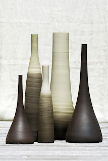
The second set of vases that I found I liked because they are so sleek looking. As with the first project I really want to work on making my projects look very refined. I love the vase on the far right, it has more of the triangle shape than the first vases. I like that more pronounced shape more, I think I will do a happy medium of the two styles.
http://graphic-exchange.com/09design.htm